Color Analysis: My 36 Colors
I feel so lucky to be surrounded by so many stylish people. One of my favorite ladies is one-third of Stylista, Calgary's top styling firm. We met while working for the same homeless shelter and have since become great friends. She kicks my butt and talks me off my ledges often. She has a keen understanding of your style pain points and a sharp eye for finding pieces that not only make you look great, but feel UH-MAZING! She helped me find a dress for a Christmas party a couple years ago. One hour and less than $100 spent, and not only did I look like a boss for the party, but I got a date out of it. :)
Read also: 5 Essentials for Spring Style
I met Michele from Hue & Style via Instagram during United Way's 2014 June Dresses campaign. She is a color consultant, wardrobe strategist and a professional cheerleader (at least it seems like she is). She is boundless in energy, limitless in inspiration and endless in confidence. Like, I want to be besties with her for life!
We met earlier this year to talk about color, style and confidence. I signed up for her virtual color draping session, where she completes an in-depth analysis based on a questionnaire and photos you send in and gives you a palette of 36 colors that fit your color "season".
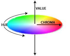
Color 101
Michele started the coaching session by talking about color. We chatted about hue, the cool and warm quality; value, or the light and dark quality; and chroma, the brightness quality. Everyone's color season lies somewhere on this chart.
We then chatted a little bit about contrast. She looked at my hair, skin tone and eyes to determine my unique contrast.
First Thoughts
Before she virtually draped me (Wait, what? Don't worry, we will get there.), we talked about her initial observations based on my questionnaire. Summary: brown eyes, pale skin tone and a hair color that has no idea what color it wants to be.
Color Draping
This was the most unique assessment I've ever had done. I was to send in four photos of myself wearing a color I didn't like, a color I liked, a black top and a scooped-neck top. Michele shared some of her general observations around how each color created shadows, ruddy textures or gave my face some overall clarity. The goal is to find a palette that will smooth out skin, even tone and have a buttery look to it.
She then showed me how she determines my color season by draping. I don't want to give her draping technique or secrets away (schedule an appointment!), but she virtually draped my photos eight times to understand where I fit on the color graph, or which color season I belong to.
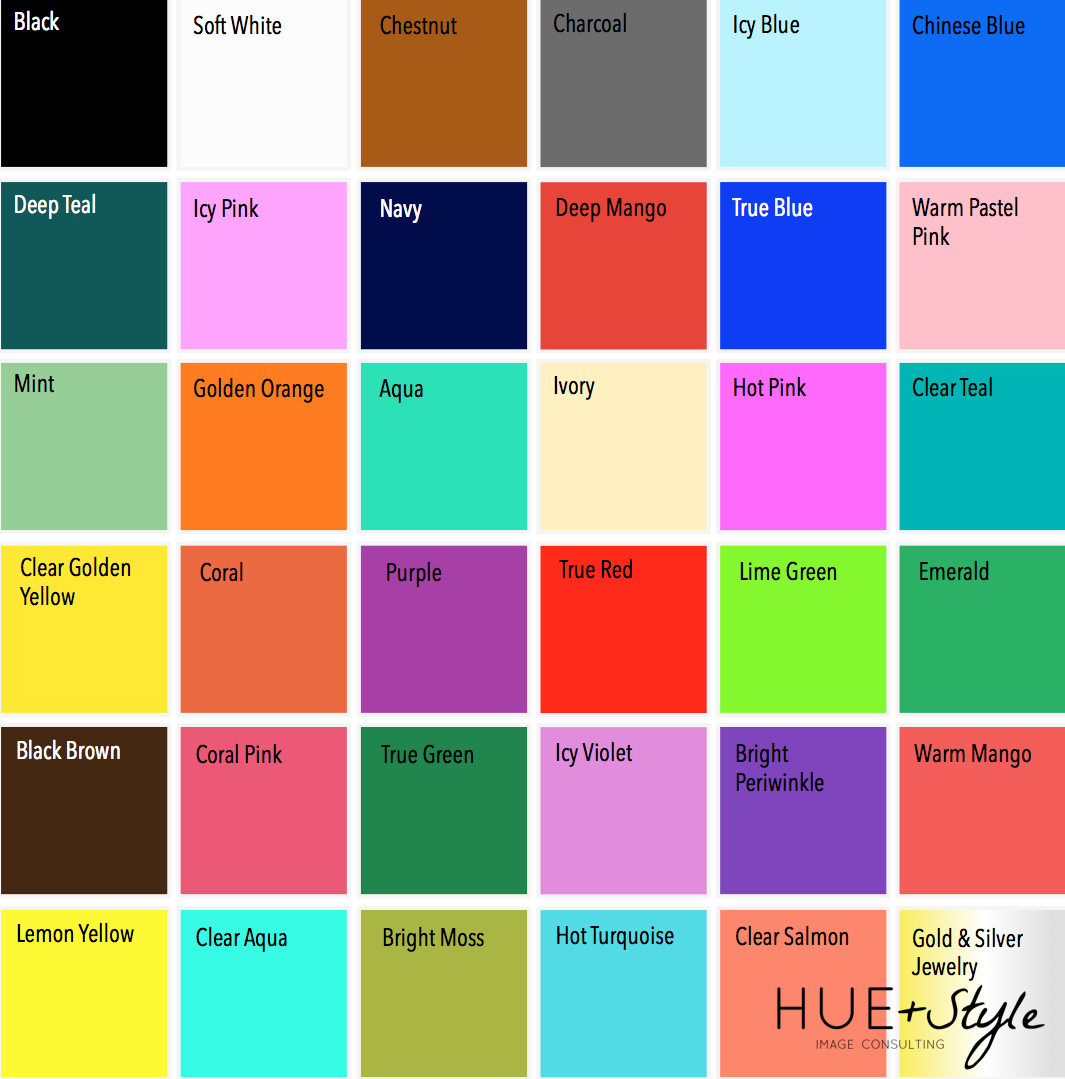
My Colors
Michele used her initial observations plus her draping to determine that my color season is....DRUM ROLL!....
CLEAR SPRING
I know...what?
This means I get to wear all the bright colors! It means that my dominant color characteristic is clear, which sits high on the chroma scale. My secondary color characteristic is warm, which sits on the warm side of the hue scale. Lastly, my season is light, so it ranks high on the white value.
To be honest, I was surprised by a few of these colors like the lime green or lemon yellow. For those of you who know me well know that my closet is black, white, grey and brown.
However, I think this palette is a great tool for anyone who is, like me, quite lazy when it comes to clothes. I like quick, easy and little effort. So this makes putting outfits together SO easy. Any one of these colors will go well together. Mint top and lime green clutch, anyone?
And having this tool makes me feel a little bit more confident about clothes shopping. I have spent hours in a dressing just trying to decide if something looks good enough to hand over my hard earned money for it. But I can go in to a store, scan for colors, look for fits, try it on and boom, shopping complete!
Michele included some great pointers in her analysis to help me pick the right colors. For instance, she told me than when I am looking icy blue to think about the sky at dawn. She also jotted down my "power colors", which are the lime greens, hot pinks, purples; and my "no-no" colors, which are anything pastel. My neutrals are black, white, chestnut and charcoal - or everything in my closet now.
Final Thoughts
I'll admit this (sorry, Michele!), but when I first signed up for the color coaching, I was hesitant. I thought, "what did I just do?" Michele quickly took my assumptions and threw them right in the bin, like a very emotional "What Not To Wear" moment. As she was presenting my color analysis, I began to see the value in knowing your best colors. These colors are a tool to help you not just look great, but feel great. And when you feel great, you exude confidence, and there is nothing quite like a woman filled with a humble confidence. I'm beyond grateful that I have not only had the pleasure of meeting Michele, but having a conversation and learning from her.
Even if you are remotely interested in understanding your colors better, I highly suggest checking out Michele. She will become your color and confidence cheerleader. Like you really can't help but be happy when she's the in room. Check out her Periscopes and you'll see why. This analysis is a great option for anybody who is starting a new chapter in their life or looking to make some small changes.
You can find Michele here:
Website: Hue & Style
Twitter: @MCGustafson
Instagram: michelecharlesgustafson
Periscope: @MCGustafson
Now, if y'all will excuse me, I have some color to shop for.